In today’s economy if you can do it yourself (DIY) why pay for someone else to deliver you a product? I get it. Truly, I am queen of DIY projects. However when it comes to photographs, I take using a professional service more seriously. These are your memories. This is your legacy. This is what your grandchildren will want to pull out when they come to visit. You’ll sit on the couch for hours, reminiscing about when their parents were younger. Sharing those moments with them and making them see and feel the detail, the emotion, the relationships… you won’t get that from a flash drive, and you won’t get that from staring at a computer screen or even prints that are low in quality.
This is close to my heart as I lost my grandmother just over a year ago, and the memories I have of her are more vibrant when I go through my photographs. Imagine losing someone very close to you. In the midst of all of the grief you find yourself with all of their belongings. Most of it is stuff… important because it belonged to her… but stuff… material possessions. As you pull items out of the closet and the sunlight catches the dust in the air, you see an old box on a shelf. It feels heavy. You pull it down and open the lid. Out pours memories, life, love, laughter, smiles, side eyes, silly faces, little people, big people, people you somewhat recognize, people you don’t know, old clothes… your dad wearing shorty shorts… your parents kissing, your beautiful grandmother on her wedding day. Some photographs have faded but you feel as if you knew her then, on that big day. It’s like you are part of her world as she will always remain part of yours.
Now imagine that the box you pulled down was a box of flash drives and CDs. Would you feel the same emotions? Would you be brought to tears over flash drives? Would you smile fondly at a CD?
There are some serious problems with digital files. Digital files can be lost easily. Where did that thumb drive go? As you move them from old computer to new computer you lose quality and risk corruption. AND, technology is ever-changing. We don’t know if computers will even have USB drives in a couple years. Apple has already done away with disc drives so no more CDs in your Apple computer.
THIS is why prints are so important to me. This is why I do what I do… to treasure and share the memory of you and your loved ones. I want you to have physical products and not just digital files. Items you can touch. Items that make you feel. So pro prints or drugstore prints? Take a look.
To drive this point home, I printed 4×6 images from several different labs. You will be surprised at the differences. The image of this baby was meant to be soft, pink, creamy and have a dreamy feel to it. The first in the series is the professional lab that I use for personal and client prints. Notice the differences from lab to lab. Read below for my evaluation of each lab. Original file at top:

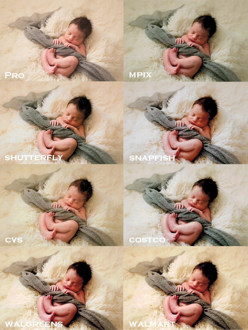
The Professional lab printed very closely to the original file. This is the way I meant for this print to look – soft and creamy with a pink baby. It is on true matte paper so you see slight color desaturation. There limited labs where I can get actual matte paper, and it is amazing paper. It’s all I print on.
Mpix did a nice job not increasing the contrast too much and not blowing out the highlights. (Contrast – compare the darker parts of the images – shadows, his hair… and for Highlights look at the bright parts – the left side of his face and the cream fabric to the left of the baby.) However, mpix removed the creamy pink coloring which takes away from the newborn feel. When you go with mpix choose “do not color correct” if you’re printing professional images with the consent of your photographer. This ensures that the colors the photographer chose will be what is printed.
Shutterfly increased the contrast so much that baby’s hair is much darker than it should be. The coloring of the baby is orange, and they blew out the highlights so that there’s not texture in parts of the fabric underneath baby. The quality of the photo paper is inferior to the others.
Snapfish made the baby’s skin very orange and muddy. They also upped the contrast too much. The photo was also noisy, meaning there was very noticeable grain in the photo especially the shadows. The quality of the photo paper for Snapfish was similar to that of Shutterfly.
The good thing I can say about CVS is that they didn’t blow out highlights or increase contrast so you get a softer feel which I like. However, the entire image has a yellow fog over it making the whole photograph look jaundiced… if you know babies you know this is no good.
The contrast in the Costco print is once again too much. It creates a very harsh looking image. They also over brightened and blew out the highlights, including some in the baby’s face.
Completely and totally avoid Walmart and Walgreens. These two destroyed the image. The baby is orange and red. The image contains entirely too much contrast. Highlights are blown, even in the face. The overall image is not dreamy but quite harsh instead with grain decreasing the overall creaminess. In addition these images were not sharp compared to the others.
I cannot stress enough how important these memories of you are to me. Your wedding day won’t happen again. Your baby will grow right before your eyes. You may never capture that expression in your three year old again. Grandma’s warming smile can be frozen in time in a photograph. Get these images in your hands and out of digital format. And, ask your photographer who you should choose. They will know who can handle the printing process for their own images.
Want to see more gorgeous ways to display your images? Of course you do! Email me for my Client Guide filled with hand selected heirlooms for your family.
Oh man, I’m so surprised at how Mpix turned out. I recommend them to all my clients! I will now tell them to not color correct! Thanks for doing this, Jacqie! 🙂
Also super important to note are "proof colors" and calibrating your screen to the printer of your choice in any newer version of PhotoShop — these profiles will help keep your prints perfectly managed with color consistent workflow.
I’ve worked with a Noritsu digital printer before when I managed a portrait studio and the results were nothing short of amazing! You can actually calibrate your equipment/machine/program to flex to a variety of digital photo labs by going here: http://www.drycreekphoto.com/icc/index.html
Would recommend. It will bump those CostCo prints into pro territory. Also a note: if your images have been filtered for added vintage/retro effect, places like CostCo and Snapfish automatically assume that those images are, in fact, old and "not supposed to look like that." But with the right color profiles, all that autocorrect madness can be totally avoided.
Good post!
Good point. It’s important for photographers to be sure they are calibrated for the lab they use.
Only the pro lab I use offers the type of paper and print I prefer for my work, so I callibrate to that printer.
Good point. It’s important for photographers to be sure they are calibrated for the lab they use. Thanks for the link.
The pro lab I use offers a specific type of paper and style of print I prefer for my work, so I calibrate to that printer.
I’d love to see a comparison if you do one.
Yikes! Now even happy w mpix!! Great blog post. I’m gonna share on my biz page!
I’m shocked at Mpix too! I tell all my clients to order through there if not through me. This is so informative, definitely sharing this. Thanks for putting this together!
This is why I always hire a pro for our family photos because I’m awful at spotting that stuff, but when you point it out, it seems obvious.
This comparison really brings it home. Higher standards mean better prints. Very effective visual!
Wow, this is a really good point. I should do the same research up here in Canada and share my findings with my clients. Thanks Jacqie!
Wow it’s really interesting to see the different quality of print! ! Great post! Thanks for sharing!
Jacque – What a great post; inspires me to do one. Do you have the original (digital) image posted somewhere?
totally cool!!
I did not. Side by side it was very similar to the pro print (matte paper). I did another round of "do not color correct" prints. I’ll post it with that. 🙂
Wow, I can’t believe how varied the results are. Thanks for doing this and sharing your results, Jacqie!
Totally sharing this post. I can’t believe the color difference!
Amen! To you!
You said it perfectly when describing the emotion you have when you are holding a beautiful photographic portrait in your hands. This portrait becomes all the more special when you have it printed from a pro lab.. This is article hits it home nicely! Bravo!
I need to do this myself with an image.